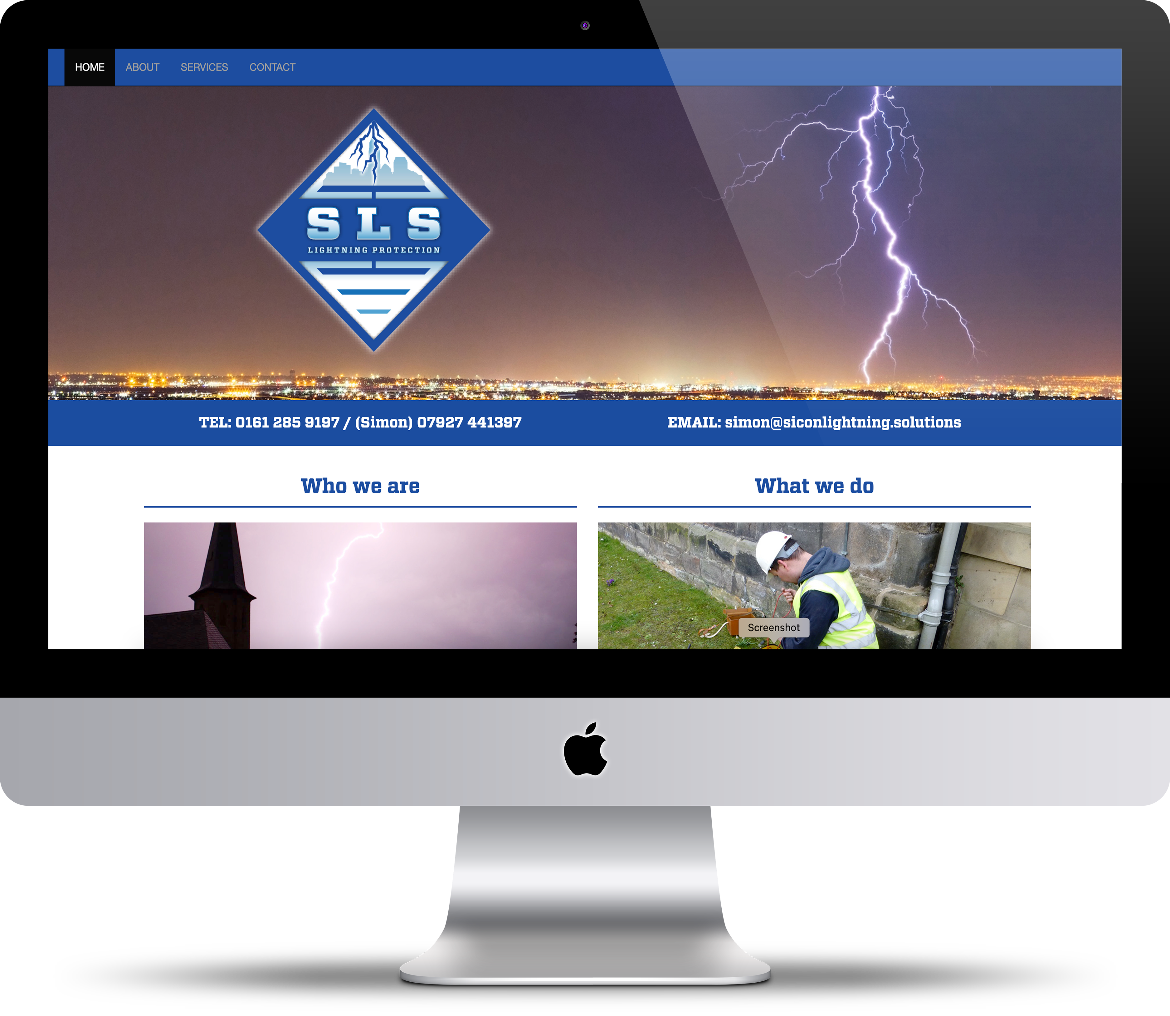
SLS Lightning Protection
Sicon Lightning Services is a lightning protection business based in Manchester. They required a new visual identity and branding system to take the business forward in a more consistent manner.
I developed a visual identity that is literal and bold. It will be used in a consistent style across different digital and print media including vehicle livery.
The symbol is a simplified representation of a lightning fork striking the symbol for ground. This is a distinctive way of including the literal symbol for lightning protection within the logo.
A deep shade of blue was chosen to have a professional and trustworthy contrasting tone for the business. The typeface chosen is a strong slab serif that further reinforces the security and strength of the business.
• Conceptual thinking
• Art direction & development
• Print & Digital design
2020
Design
Please click the button to see more examples of my creative design work.
Click to see portfolio
Illustration
Please click the button to see more examples of my illustrative work.
Click to see portfolio